How do you visually portray a genre of music that often doesn’t have vocals, uses mostly computerised sounds and sometimes doesn’t even have a beat?
Ambient music began to grow in popularity in the mid-to-late 90s with techniques like tape looping and has continued to grow until this day with evolution and fusion genres like lo-fi hiphop achieving massive success.
From a design perspective, ambient music has naturally adopted the design traits of its sound, alongside a modern and often highly minimalist aesthetic.
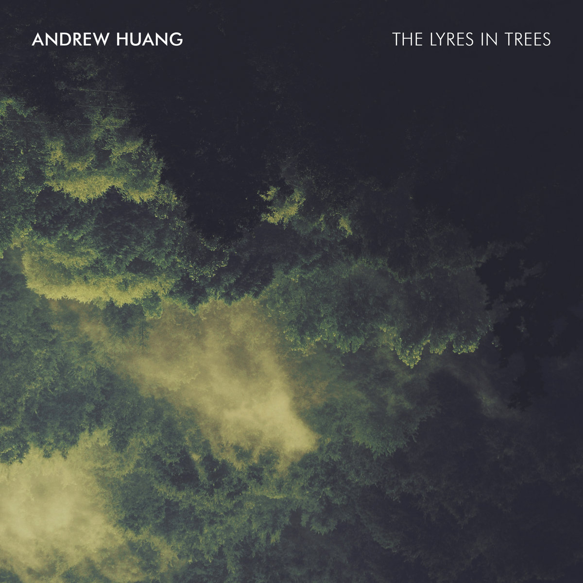
A good example of this would be Andrew Huang’s 2017 album, The Lyres in Trees.

This aesthetic is the most common interpretation of ambient music throughout the genre; clean, minimalist and often natural imagery with little stylisation or extra visual noise.
This style translates into the typeface as well, primarily using bold, sans serif fonts and white lettering on a darker background. Text’s inclusion is often minimal with very small lettering being used for the essential details which adds to the relaxing atmosphere the music is trying to create; the music itself isn’t bold so why should the typography be?
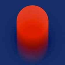
This minimalism can be taken to extreme lengths as seen in the design of the album Forever Hum by Cory Allen.

This art boils down the ambient style to its barest form, removing text entirely and focusing on a single combination of colours to achieve an atmosphere of calm and serenity, a perfect match for the sound of the album.
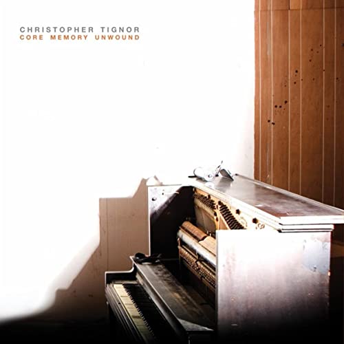
While more contemporary ambient music is less common, it is still an important and much-loved part of the genre. Core Memory Unwound by Christopher Tignor is a great example of this sub-genre, expelling in creating ambient music using more traditional instruments like pianos and violins as well as making use of chapel halls for natural reverb.

While this artwork sticks with the traditional ambient format, it echos a more classical theme. The small, inconspicuous text combined with the largely empty frame and lack of colours suggest a more somber and weathered story.
For a genre of music that consists of so little tangible sound, ambient has created a surprisingly consistent theme in its visual design and, while it certainly takes inspiration from the modern, minimalist trends, I believe it is also highly recognisable and emotive in its own right.