The world of motorsport is, much like its cars, fast, flowing and constantly evolving to reach new limits and push evermore distant boundaries.
It comes as no surprise then that its design ethic aims to echo these values as much as possible, incorporating both the emotional, traditional aspects of the sport as well as its cutting-edge technology and commitment to constant and ruthless advancement.
This complex blend of emotions and priorities bleed into all aspects of motorsport design. From the team-wear to the circuit advertisements to the liveries on the cars, bright colours and bold branding are never in short supply.
So what of the typeface? Well, in the case of the premiere world motorsports category, Formula 1, the current typefaces have not been publicly released however, thanks to the work of design studio The Logo Smith, these typefaces have been lovingly recreated and categorised, allowing us to take a closer look at the ideas behind Formula 1’s styling.
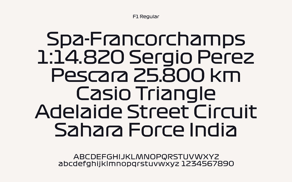
F1’s current typefaces were introduced in 2017 and aim to mimic the design of a top-down track map by incorporating a blend of smooth curves and sharp angles to create a highly modern sans-serif design.
Straight lines are at the heart of the F1 Regular type with letters like ‘a’ and ‘c’ incorporating them into what would otherwise be a more gentle curve on a conventional typeface. While smooth curves are prioritised where required, sharp corners are introduced to prevent the font from becoming too flowing and loosing its exciting, precise edge that is at the heart of the Formula 1 philosophy. Letters are connected where a straight line will allow, as if the sheer speed has pulled them together and accenting and punctuation are reduced to highly minimalistic thin lines and squares, again meant to evoke precision and clarity.

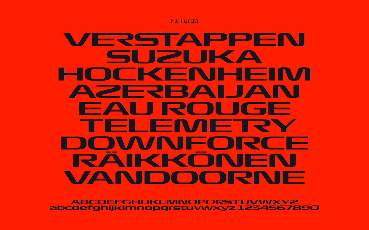
F1 Turbo represents a more extreme, eye-catching brand image and is hence often used for titles and openings. The text is wide and aggressively designed, incorporating both thin and wide lines with little in-between. This font is often presented in bright red, or on a bright red background to further accentuate the raw forces experienced while driving a Formula 1 car.

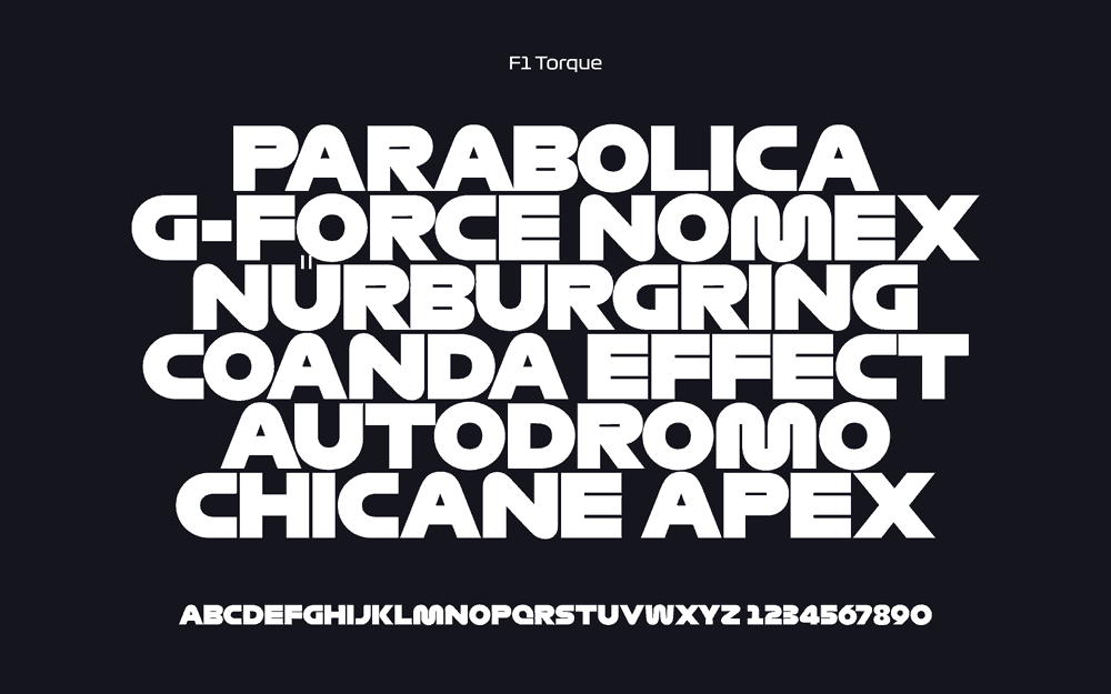
If F1 Turbo accentuates the extremity of the sport, F1 Torque reflects its calmer, more scientific and mathematical angles. There is a greater use of curves and less of the more intense elements; punctuation and accenting is slightly less aggressive and letters no longer overrun into each-other.
There is minimal negative space within letters such as ‘E’ and ‘M’ to promote a modern aesthetic and the type is available only in upper-case, suggesting it is primarily to be used for large physical branding such as on the side of buildings or painted in race track run-off areas, spaces that F1 management have been utilising more and more over the last few years.

Formula 1 Management does disclose that it uses the Titallium font for its website and article typeface, an open source font with a minimalist, modern look.
Titallium can be downloaded here.
Outside of Formula One’s own typeface, there are a slew of companies who invest in the sport and its various teams whose brand identities often line up with Formula One’s own due to the fact that they believe that the exposure they will gain from participating in the running of the sport will be worth the financial investment.
A good example of this would be DHL, F1’s primary logistics partner. The connection between fast cars and fast deliveries is an obvious one with DHL’s pre-existing branding lining up well with this idea; a modern, sleek, sans-serif type with dramatic italicise, horizontal gaps within the lettering and lines running before and after the logo, all indicative of both speed and dependability.
Different sports usually have similar modern, slick typefaces that wouldn’t look out of place in a gym or on a tracksuit, however Formula 1 has such an intrinsic connection with speed and extreme forces that I believe its design aesthetic is far more dramatic and eye-catching than those incorporated by other sporting bodies and, in the process making it a fascinating case study for those interested in converting physical movement into something as simple as letters and numbers.
Thanks again to The Logo Smith Design Studio for providing these typefaces, you can check out their website here.